Alive - myalive.com
Background
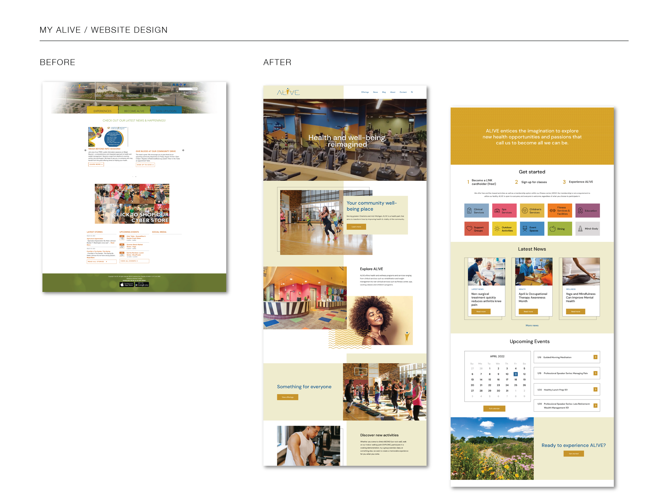
MyAlive, a health park that aims to transform lives by improving the health and vitality of the community, needed a significant overhaul to its existing website. MyAlive had an outdated website design that didn’t accurately represent who they are. The website didn’t make it clear how to become a member or show the breadth of their offerings in an organized way. Additionally, they wanted to be able to share events, news and blog articles to keep clients up to date on the latest offerings. Some of the language on the site was confusing for a newcomer. The site layout was static and not visually appealing. They sought a website that would be aesthetically pleasing and convey the large amount of their services in an easy-to-understand way.
Objective
The goal was to update the design to convey the quality of their facility and breadth of services to the community in an intuitive and visually engaging way. The aim was to achieve a website that truly reflects who they are present what they offer in a clear, easy-to-navigate format, to make it easy for potential clients to sign up and for current clients to be able to discover and sign up for upcoming events.
Solution
To simplify the signup process for prospective clients, I applied Donald Miller’s Story Brand principles, breaking the sign-up process into 3 easy steps and writing headlines that were engaging, simple and SEO friendly. To make their large amount of services intuitive to navigate the services were broken down into 10 color-coded categories. For each category, I designed custom icons from scratch using Material Design’s iconography guidelines, working with a grid and keyline shapes to produce pixel-perfect, proportional, and visually consistent icons. I created a design system that included a custom color palette and typography styles using a type scale and 8-point vertical grid. The homepage was designed to showcase the facility with panoramic aerial video footage. In addition to clearly stating what Alive offers and how to sign up, upcoming events news, and social callouts were featured. For the interior services pages, an intuitive tiered accordion navigation was designed. The color coding and icons kept the experience cohesive. The vast amount of content was distilled into an elegant, useful interface that kept the user’s experience at the forefront. Prototypes were created in Figma to display functionality. The new design allowed users to find events and classes easier, streamlined calls to action and reduced the amount of time internal teams needed to spend fielding questions from visitors via phone/web form.
PM Environmental - pmenv.com
Background
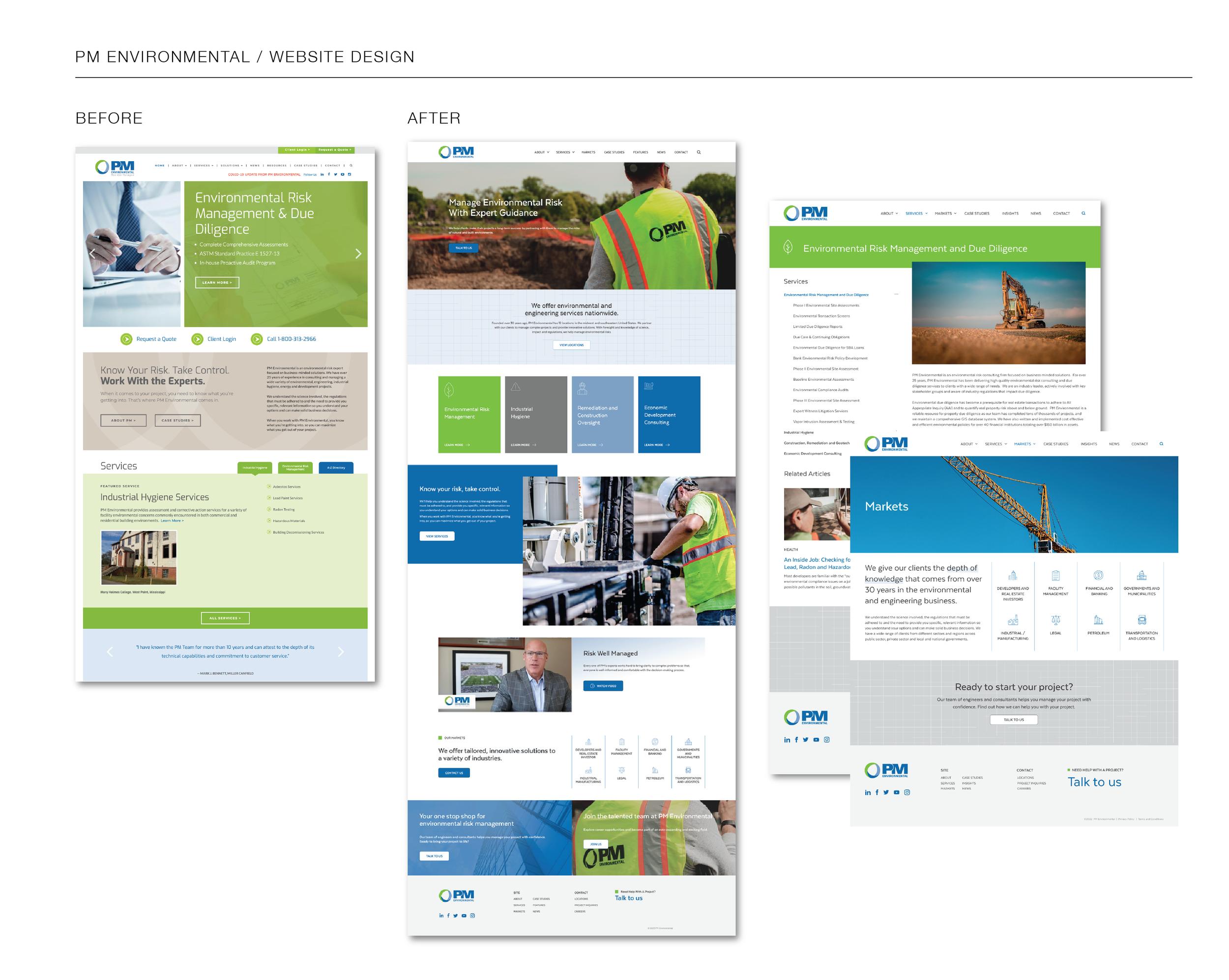
PM Environmental, a Pinchin company, is an environmental risk expert focused on business-minded solutions. PM Environmental had an outdated website using generic stock photography, a trendy font and a static layout. They needed their branding on the web to be brought up to date so that the website could convey the value of their services.
Objective
It was important to present a professional, visually captivating impression that allowed users to more easily accomplish seek information about their services, stay up to date and connect about projects.
Solution
I started with a moodboard and style guide to outline the proposed look and feel. This included color palette, icon and button styles, typography, photo style, and graphics examples. I started with wireframes and moving to high-fidelity mockups. I created a Design System using colors, and typography styles built with a type scale on an 8-point vertical grid. For the website, I created a custom vector-based pattern to enhance their branding, and curated icons. I used components in Figma to streamline and help aid in handoff to development. The result was a modern responsive design that set the tone for their brand identity and conveyed their value.
Oxford Biomedical Research - pmenv.com
Background
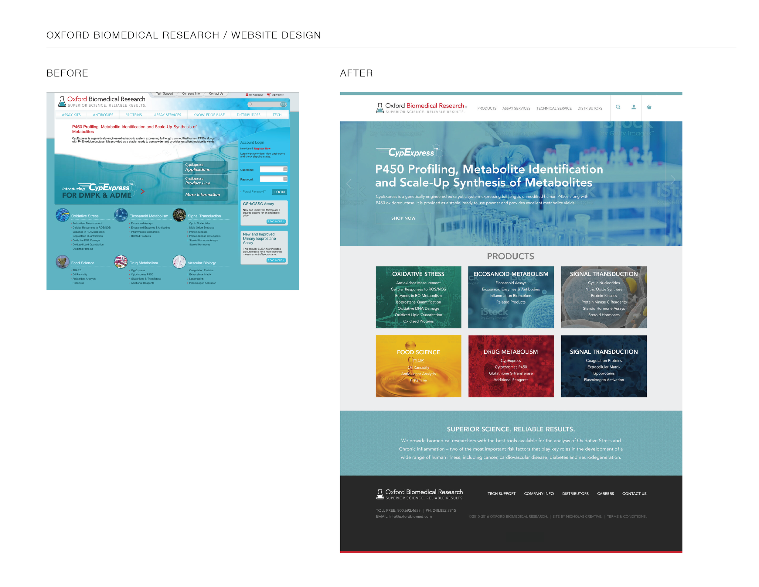
Oxford Biomedical Research (OBR) develops, manufactures, and markets assay kits, recombinant proteins, and antibodies for biomedical research and drug discovery. They needed to bring their site up to date with a modern design that portrays the company as the cutting-edge industry leader that they are.
Objective
The objective was to design a site that was clean, easy to shop, and aesthetically appealing.
Solution
I brought the web branding up to date making what could be an otherwise ‘boring’ subject interesting through visuals. Bold colors and imagery were used while maintaining the branding via color. I designed the checkout process to allow customers a seamless experience purchasing online.
Past work experience
I have a strong foundation in visual design and a talent for distilling complex content into elegant, useful interface. I'm committed to excellence using best practices to create innovative solutions. I am passionate about making a difference through UI/UX design. I value empathy– only by truly understanding the goals and the people using the product, can we solve problems and drive growth. I could use my design acumen to help BIG Wall Décor develop a beautiful website and foster cohesion throughout different outlets such as email and social media. I can help to create a dynamic and engaging web experience, keep return customers interested, showcase artists, make new customers aware of how easy the process is, highlight unique selling points such as sustainability efforts, etc. so the website can see increased traffic, conversion, less dropped carts, and ultimately grow.
As a Senior UI designer at Spartan Internet Consulting, I collaborated with a large team to discern needs and develop creative solutions that produced trackable results. As lead designer, I was solely in charge of creating the look and feel of a site, developing the layout and site styles, and ensuring they were translated across the board. Utilizing thorough research of competitor efforts, customer needs, and industry trends, I implemented design strategy that led to quantifiable results.
In addition to consumer-facing websites, I have designed user interface for intranets and mobile applications. I have designed for all aspects of digital marketing including branding, email, ads, and social media. My work reflects my passion for web design. Given my experience, critical thinking, and creative conceptual skills, I could help BIG Wall Décor deliver a best-in-class experience starting online.