Wellness Center Website
Homepage

Background
MyAlive, a health park that aims to transform lives by improving the health and vitality of the community, needed a significant overhaul of its existing website. The site had an outdated design that didn’t accurately represent who they are. It lacked clear instructions on how to become a member and failed to present the breadth of their offerings in an organized manner. Additionally, they wanted the ability to share events, news, and blog articles to keep clients informed about the latest developments. Some of the site’s language was confusing for newcomers, and the static layout was not visually appealing. They sought a website that would be aesthetically pleasing while clearly conveying the wide range of services they offer in an easy-to-understand way.
Objective
The goal was to update the design to reflect the quality of the facility and the breadth of services offered to the community in an intuitive and visually engaging way. The new website needed to present their offerings clearly and in an easy-to-navigate format, making it simple for potential clients to sign up and for current clients to discover and register for upcoming events.
Solution
To simplify the sign-up process for prospective clients, I applied Donald Miller’s StoryBrand principles—breaking the process into three easy steps and writing headlines that were engaging, simple, and SEO-friendly. To make their extensive list of services more intuitive to navigate, I organized them into ten color-coded categories.
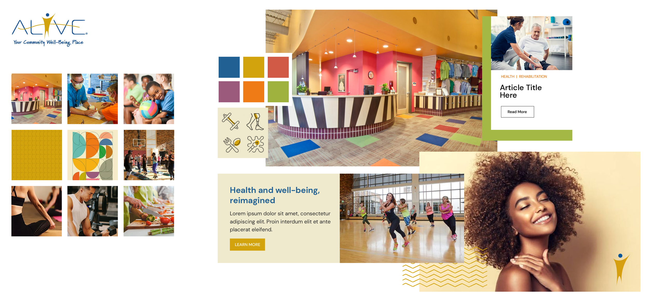
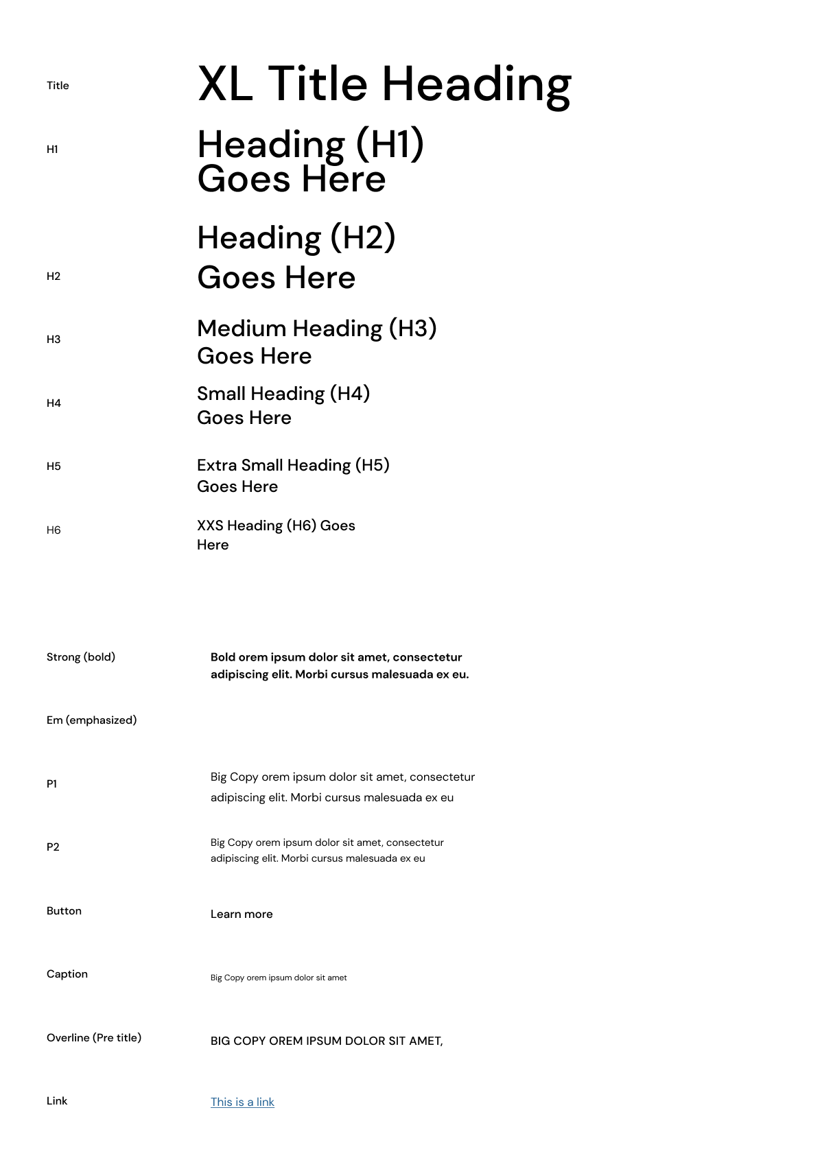
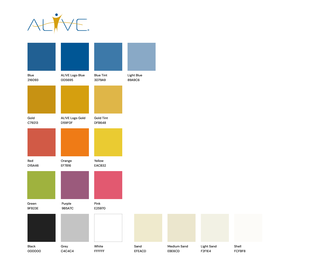
For each category, I designed custom icons from scratch using Material Design’s iconography guidelines, working within a grid and keyline shapes to produce pixel-perfect, proportional, and visually consistent icons. I created a design system that included a custom color palette and typography styles, using a type scale and an 4-point vertical spacing grid.
The homepage was designed to showcase the facility through panoramic aerial video footage. In addition to clearly stating what MyAlive offers and how to sign up, the homepage featured upcoming events, news, and social media callouts.
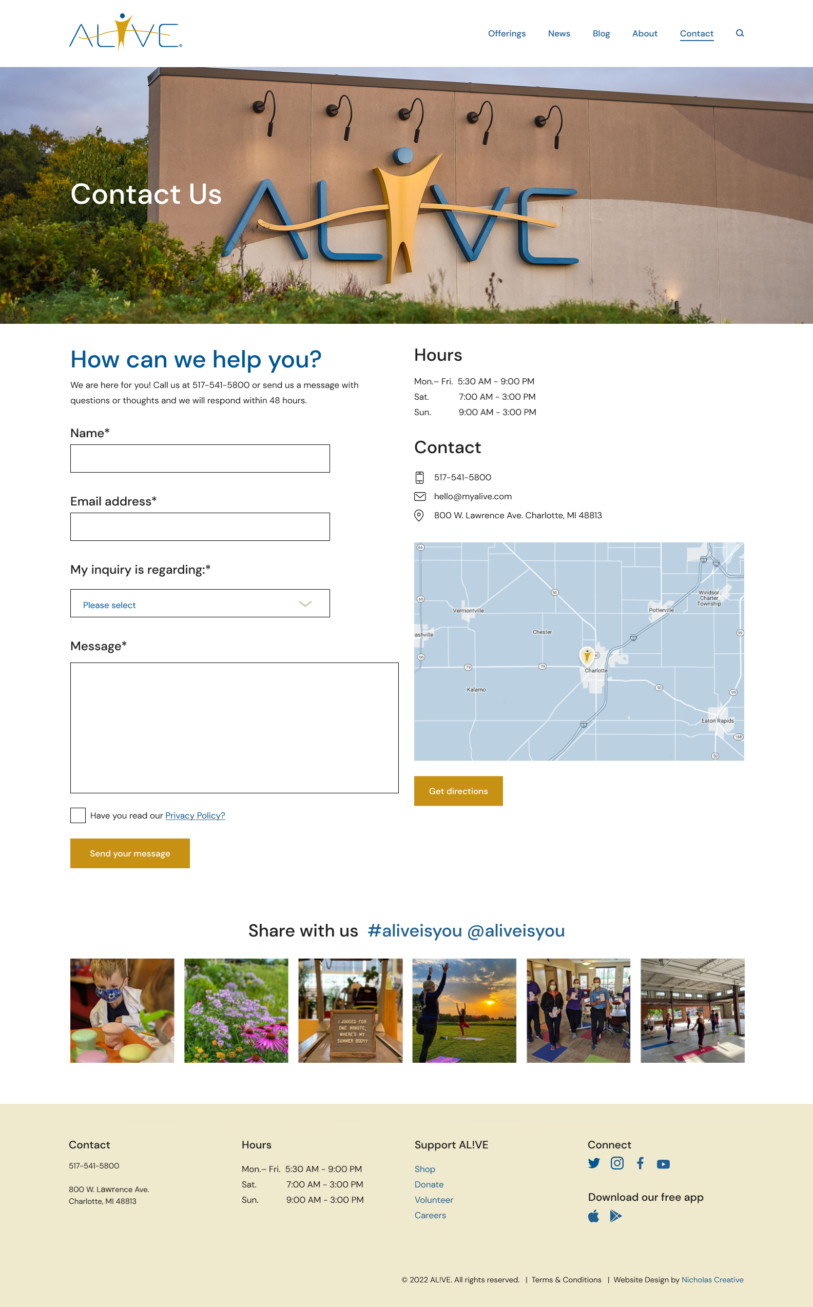
For the interior services pages, I designed an intuitive tiered accordion navigation. The color coding and icons helped maintain a cohesive user experience. The vast amount of content was distilled into an elegant, user-friendly interface that prioritized the user experience.
Prototypes were created in Figma to demonstrate functionality. The new design allowed users to find events and classes more easily, streamlined calls to action, and reduced the time internal teams spent responding to questions via phone or web forms.

Stylescape

Colors

Type Styles
Icon Design
Subpages


